


Are you ready to take the first step in becoming a professional web developer? Well, you are come in the right place!
But before you start getting all excited, let's be real for a minute. CSS can be very intimidating, especially for beginners, who are just getting started. It's like you trying to speak a foreign language you never know before, this language is full of strange terms like "properties ","div" and "selectors" that sound like they're straight out of a science fiction novel. But fear not! This tutorial is here to demystify CSS and make it accessible to even the most CSS-phobic among us. We'll be guiding you through the basics.
Plus, we've got lots of examples and interactive exercises to make sure that you're not just readin this, but actually doing and understanding the concepts.
So whether you're learning this to create your own website, or just want to polished your blog, this tutorial will set you up with the foundation that you need to to make this happen. Let's get started and elevate your design game with CSS!
What is CSS and why is it important?
The design and layout of web pages are specified by the CSS language. The appearance of web pages when they are loaded in a browser can also be attributed to CSS. The "style" of the page refers to the website's overall look and feel. The standard styling language is CSS, which often integrates with HTML (the language that defines the content of web pages).
We don't have to repeat codes while writing CSS because CSS may be utilized to limit the quantity of repetitive styling code. We must always keep in mind that fewer files and less code result in quicker page loads. You may completely tailor a website to your preferences with CSS. A website can save a ton of time and lessen the possibility of errors by using CSS to apply the same styling to many pages and different elements on the same page.
How to Write CSS
Look at the image below,
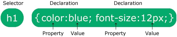
The HTML element you want to style is indicated by the selector.
One or more declarations are contained in the declaration block and are separated by semicolons.
A comma separates the name of the CSS property from its value in each declaration.
Semicolons are used to separate multiple CSS declarations, and curly braces are used to enclose declaration blocks.
There are 3 ways to with CSS Codes;
• Inline CSS
• Internal CSS
• External CSS
Inline CSS
To add CSS code straight to an HTML element, use inline CSS. This can be accomplished by directly inserting the CSS rules into an HTML element's start tag and attaching them to the element using the <style> property.
There are numerous CSS property and value pairs included in the style attribute. As is customary for all CSS codes, a semicolon (;) is used to separate each "property: value" pair.
For example,
<h1 style="color:blue;text-align:center;">This is a heading</h1>
<p style="color:red;">This is a paragraph.</p>
Internal CSS
Internal CSS style sheets are introduced using the same <style> element as Inline CSS in the <head> section of an HTML document rather than directly to the HTML elements. Any number of "style" elements in an HTML document may be defined using this, but they all must occur between the "head" and "/head" tags in order to have an impact on all HTML components.
Let's take a look at the example below,
<style>
body {
  background-color: linen;
}

h1 {
  color: maroon;
  margin-left: 40px;
}
</style>
All of the CSS codes are present in the HTML document's Head section, as shown in the sample above.
External CSS
How do we go about applying CSS styles to numerous pages? We link our various style sheets to the file containing our HTML document in order to employ external CSS.
When we want to apply a style to numerous website pages, the external style sheet is the ideal option.
All the style guidelines are contained in an external style sheet, which you may link to from any HTML file on your website. The most adaptable are external style sheets because you can alter just one file to alter the appearance of a complete website.
The <link> tag can be used to connect an HTML document to an external style sheet. Direct insertion of the <link> into the <head> section is possible.
<!DOCTYPE html>
<html lang="en">
<head>
    <title>My HTML Document</title>
    <link rel="stylesheet" href="css/style.css">
</head>
<body>
    <h1>This is a heading</h1>
    <p>This is a paragraph of text.</p>
</body>
</html>
CSS SELECTOR
We are aware that HTML elements are styled using the design language CSS. And you must choose the elements you want to style first. You've previously gotten a taste of how this works, but let's look at three alternative approaches to pick HTML components using CSS selectors.
Class Selector
In order to choose components that belong to a particular class using the Class Selector, we must always write the class name after the period (.) character. Let's look at the example below
<div class='container'>
    <h1> This is heading </h1>
</div>
container {
    colour : red;
}
We can see in the code above , we have assigned a class to the div element which contains the "container" and we also assigned the color to be red in the stylesheet.
ID SELECTOR
Using the ID Selector an hash (#) character should be written after the element's id in order to pick it instead of the (.) used in the Class Selector. The id selector is used to choose a single distinct element because each element's id is distinct inside a page.
The id selector chooses a particular HTML element by using the id attribute.
<div>
    <p id='container'> This is a paragraph </p>
</div>
#container {
    color: green;
    font-size: 16px;
}
Element Selector
This is the first way to select an HTML element by selecting the HTML element name. Let's look at the example below;
h1 {
    font-size: 40px;
}
p {
    color: green;
}
div {
    margin: 40px;
}
In the code above, we have selected the real HTML element, the above code will change according to what we choose.
We can also group the code if the HTML element contains the same code.
Like as an example;
h1 {
  text-align: center;
  color: red;
}

h2 {
  text-align: center;
  color: red;
}

p {
  text-align: center;
  color: red;
}
We can group the above to be like what you're seeing below now.
h1, h2, p {
  text-align: center;
  color: red;
}
Universal Selector
This can be used to select all the element on a page, it uses the asterisk function (*).
* {
  text-align: center;
  color: blue;
}
CSS FONTS
CSS gives us countless possibilities for modifying fonts, colors, and the visual appeal of our HTML elements. There are two different font family names available.
• ### Generic Font Families
There are five generic font families in CSS:
Serif Font : Each letter in a serif font has a little stroke around the outside. They convey an air of formality and refinement.
Sans-serif ; typefaces are simple in design (no small strokes attached). They give the area a contemporary, clean appearance.
Monospace fonts
: in these, every letter has a fixed width. They produce a mechanical appearance.
Cursive fonts mimic writing done by hand.
Fantasy fonts are ornamental or whimsical typefaces.
Font Families
a specific font family (like ‘Times New Roman’ or ‘Arial’)
CSS VALUE
Each CSS property has a unique set of values, and the value determines how an HTML element's attribute will be styled. The values of some common characteristics are listed below.
• The font-family property accepts the written names of web-safe fonts like Arial, Times New Roman, or Courier.
• The width property scales the element in relation to the width of the parent container and can take a length value, such as px (pixels), or a percentage. For instance, a div> set to 50% width inside the body> tag will occupy half the viewport's width.
• The Colour Property.
There are numerous layout and positioning techniques that can be used in controlling the arrangement of an elements on web pages, examples are CSS flexbox and grid.
Flexbox:
CSS flexbox can be used to create different rows of items that are evenly spaced apart and are aligned to the center:
.container {
  display: flex;
  justify-content: space-between;
  align-items: center;
}
Flexbox can also be used to create column of items that are vertically spaced apart from each other.
container {
  display: flex;
  flex-direction: column;
  align-items: center;
  overflow-y: auto;
}
Grid:
Grid can be used to create a 2-column layout, where the first column can takes up to 2/3 of the real width and the second column will takes up the remaining 1/3 of the width
.container {
  display: grid;
  grid-template-columns: 2fr 1fr;
}
It can also be used to create a complex layout that consists of a header, a sidebar, and a main content area.
.container {
  display: grid;
  grid-template-columns: 250px 1fr;
  grid-template-rows: 100px 1fr;
}

.header {
  grid-column: 1 / 3;
  grid-row: 1;
}
.sidebar {
  grid-column: 1;
  grid-row: 2;
}

.main-content {
  grid-column: 2;
  grid-row: 2;
}
Combining both the CSS grid and flexbox to create a complex layout is possible With either CSS Grid and Flex, you will achieve your aim.
Tips on Creating Responsibe Design
Creating responsive designs that work well on different screen sizes like smartphone, tablet and computer can be very challenging,but if you follow the tips listed below, you'll be well on your way to create a responsive designs that will work well on different screen sizes
Don't just think about screen size: As we all know that having a responsive design is not only about the screen size. You have to think about different ways your users can interact with the website.
Using relative units: Using relative units like percentage or ems will make your design to adjust automatically by itself and according to how the screen are changing but the using absolute units (like pixels) for font sizes and spacing will not do the same.
Consider Performance : It's very important to keep performance in mind when designing for different screen sizes. Using many heavy elements like high-resolution images and videos that can slow down the page load time. Optimize your code and use tools like Google's PageSpeed Insights to help identify areas where you can improve performance.
Using a flexible grid: A flexible grid is one of the main foundation of any responsive design in web design. It will allows you to create a layout that will adapt to different screen sizes and orientations. The most popular framework for creating flexible grids is the Bootstrap, which is also based on a 12-column grid system.
Be mindful of images: Images cause a problem in responsive designs because some of them may be too large for smaller screens and maybe too small for larger screen. Make sure you use appropriate size of images and you must also consider using some responsive image techniques like using the srcset attribute to provide different image sizes for different screens.
Test on different devices: This is very important ,you have to test your responsive design on different devices and browsers to make sure it looks good and works well as you intended. You can use your browser dev tools to simulate different screen sizes, or use some online tools like BrowserStack to test your design on a wide range of real devices.
CSS Animation
CSS animation is very important and it can be used to bring different elements on a webpage to life, we can achieved this by applying some set of pre-defined animations to the elements. Animations in CSS can be created in many ways for example like using keyframes, which can be called the starting and ending points of an animation, and some animation properties, like duration and timing function, which determine how the animation behaves.
animation: name
 duration
 timing-function
 delay iteration-count
direction
fill-mode;
CSS Preprocessor
In CSS features like variables, mixins, nested rule are not present, but if we want to used this there is no way we can do that in the normal CSS, therefore we need a scripting language that will help us to compile our code in CSS and will be interpreted by the web browser, this where preprocessors comes in.
The two most popular preprocessor are the Sass (Syntactically Awesome Stylesheets) and Less (Leaner Style Sheets) .Although they both offer the same features and they are used in similar way, but there are a few key differences between them.
$primary-color: blue;

.navbar {
    background-color: $primary-color;
    ul {
        list-style: none;
    }
    li {
        display: inline-block;
        a {
            color: $primary-color;
            text-decoration: none;
        }
For less preprocessor
@primary-color: blue;

.navbar {
    background-color: @primary-color;
    ul {
        list-style: none;
    }
    li {
        display: inline-block;
        a {
            color: @primary-color;
            text-decoration: none;
        }
    }
}
Conclusion.
Thank you for reading! I believe by now,you should have a basic foundation on how CSS works, sit down and go through over and over again after you have gotten a good grip of this , you can check our blog to learn more about CSS grid, CSS flexboxs and more.
You can follow me on Twitter here